WORDS BY BRIE HAYES
![]()
Kitchens are always the heart of the home. They are often the room that sells a home, and typically the first area a homeowner wants to upgrade. There are so many choices for backsplashes, countertops, cabinets, lighting, flooring and appliances and it has never been easier to plan your dream kitchen online.
But with all those choices at your fingertips, it can be difficult to pull everything together in a cohesive look. Here are just a few kitchen design flaws I have seen with my clients and my recommendations to remedy them.
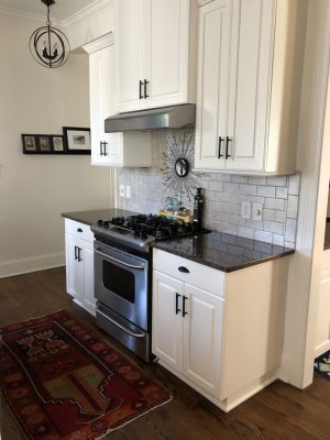
 Lately, I am seeing a lot of kitchens with too many “stars” or focal points. The “star” could be cabinets painted in a bold color, eye-catching granite countertops with a lot of movement, or a bold encaustic tile backsplash. Separately, these all come off as stunning; however, the problem arises when there are too many “stars” competing for your attention. As a rule, only one hard element in your kitchen should really be making a statement. Have too many “stars”? Figure out which one you love the most and then decide how to go about relegating the others to supporting roles. Backsplashes are usually less expensive to switch out than countertops. Recently, a client wanted to change the look of her kitchen but didn’t have a large budget. My recommendation was to tone down the busy backsplash with a coat of paint and because it was a pretty easy DIY job, the client was thrilled. This can be an easy option for just about any “weekend warrior,” just make sure you prime properly! Cabinets can also be neutralized with paint, although that is usually best left to a professional. As always, just make sure you are picking the right neutral!
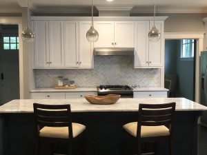
White kitchens are hot right now, but in combining the white tile, cabinetry, and countertops, it can create a lot of room for mistakes. An all-white concept can be tricky to pull off successfully. There are millions of shades of white to choose from but what isn’t as well known is that not all shades of white play together nicely. For example, if you are pairing off white countertops or cabinets with a bright white backsplash, or vice versa, you may have what I call a “clean/dirty” problem. The use of bright white next to a creamy or offwhite will cause that finish to always appear dirty by comparison. Sometimes this can be remedied with paint, but if you find yourself in a similar quandary, and painting isn’t an option, repeat the two colors again elsewhere in the room to make the color pairing more intentional. Pick a fabric with both tones for a Roman shade, add some artwork that includes the creams and whites, or just style some pretty plants in both cream and white pottery for the countertops. Good styling can cover a multitude of design mistakes!
 Another design mistake I see all too often is inadequate lighting throughout the kitchen. Not only is a dark kitchen unwelcoming, but having the wrong type of light can make the space feel more like a science lab. Every kitchen, regardless of size, should have three types of lighting: ambient (the main source of light), task (lights for the areas where you work) and accent (light that adds interest). Too many kitchens are lacking adequate task lighting. Add under cabinet lighting to eliminate unsightly shadows and illuminate your cooking surfaces. Lights should go in the front third of the under cabinet for optimal task lighting. If you want to highlight a backsplash, place the lights further back. Either way, you’ll have great mood lighting in the evening.
With all the choices available when upgrading a kitchen, it’s easy to focus too much on individual elements instead of the big picture. But as I always recommend, keep in mind that the most timeless kitchens are those with only one “star.” If you are updating your kitchen a little at a time, ask if what you are going to bring into the kitchen will work with what’s already there. And for big purchases, it’s always safer to err on the side of timeless rather than trendy. It will be a lot easier to change your wall paint or your decor than to switch out your countertops! Need help with your kitchen? Consult a designer! The cost of a consultation is much less than fixing a costly mistake!
Brie Hays is a certified Interior Designer and True Color Expert. She is available for design work and paint consultations through Harlow Hays Design Co. Follow her on Facebook or Instagram for decorating tips, or check out www.harlowhaysdesign.com

