What color should I use?
As a designer, this is the question I receive most often. People are very apprehensive when it comes to selecting color for their homes. I think folks are worried that they are going to break some color rule in the “Laws of Decorating” book (which, might I add, does not exist). Where does all of this color anxiety come from? Let’s think about color just a minute. Consider a few company logos that are the most familiar to you. Do you ever wonder why you recognize these logos? It’s because companies spend a lot of money to make sure you do.
Companies hope that the colors and the psychology that accompanies those colors ensure that the consumer will not only recognize them, but remember them when it is time to make a purchase. John Deere green and Coca-Cola red and are two great examples.
Isn’t it interesting how many of the color meanings relate to the company logo that shares that color?
For example, the Hallmark cards logo falls into the purple category, which means imaginative, while companies like Lowe’s, Dell and Walmart fall into the strength and dependability category of blue. It makes sense why they would choose these colors to brand their image.
Colors in your home
What does all this mean to you, the homeowner? It means that the colors in your home can and will affect the way you feel, interact and live.
Refer to the following guidelines when choosing your home’s palette, but remember to choose what you love, no matter what.
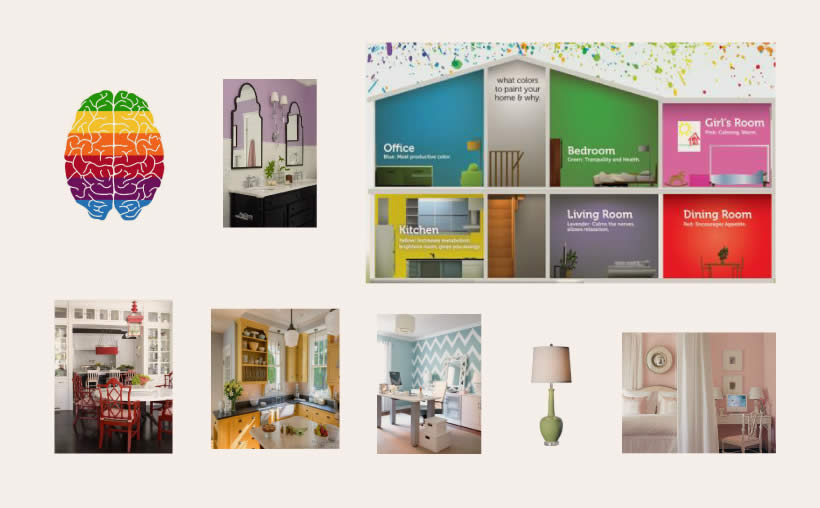
 Blue is a color that promotes productivity, in addition to strength and dependability. Therefore, home offices are a great choice for shades of blue. Since red encourages appetite, dining rooms have long been drenched in red. Bon appetit! Greens are effective in bedrooms, as they foster health and tranquility. A green bedside lamp is an excellent choice. Pink is not just for nurseries! Pink is calming and warm, so many spaces lend themselves well to the use of pink. Be brave and try adding pink to your space. Yellow does what a kitchen should do – it promotes energy, brightness and metabolism. Yellow makes for a happy place to gather. Although purple is my least favorite, I have to admit that any color that encourages relaxation is a color that my home could use.
Each of these colors creates its own mood and affects the way people interact in certain spaces and situations. While colors can affect brands we may choose and trust, they also determine the feel of our homes. Your home should reflect your personal style and how you want to feel in it, and the colors you choose will ultimately complete this reflection.

