

WORDS BY BRIE HAYES
![]()
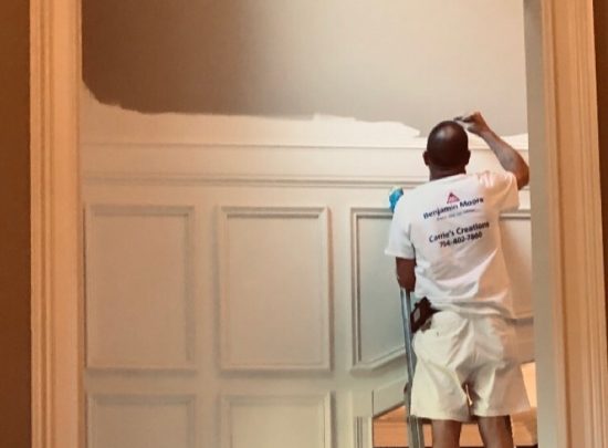
Full disclosure: I am obsessed with paint. Right now, there are over forty tester pots in my garage and well over 100 large color boards in my design library. But can you blame me? The power of paint is amazing. When it comes to bang for your buck, there is just no beating the transformational abilities of paint for updating and personalizing your space.
But before you pick up a brush or hire a painter there are a few think to think about first in order to prevent costly color mistakes. The right paint color pulls a room together and looks intentional; the wrong paint color can make you want to cry. Three things I always remind clients of are: consider the undertones of neutrals, embrace color associations, and remember that color can change on different surfaces.
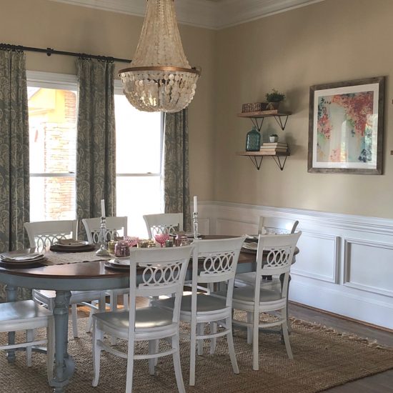
Have you ever walked into a decorated space and something just feels off in what should be a beautiful room? Frequently, the problem is that the undertone (the underlying color) of the neutrals in the room are clashing with each other. There are nine basic undertones of neutrals and some work well together and some do not. For example, yellow beige has a tendency to make pink beige look “dirty.” Undertones especially need to be considered when picking paint colors for kitchens or bathrooms, where there are existing hard elements, such as tile or countertops that would be expensive to change. Once you have identified the undertones of the large elements in the room you can then easily determine what corresponding color will work. If there are multiple undertones in a room, determine which one is “the boss” and work with that. Ideally, aim to have no more than two neutral undertones in a room and sometime just one is enough. The purpose of the paint color is to is
to pull the room together.
Color psychology is the study of hues as a determinant of human behavior and it’s become a huge industry. Corporations spend millions of dollars researching what color scheme is more likely to get consumers to make a purchase. Red has always been seen as an energizing color that stimulates social interaction; consider how many fast-food companies use red in their logos. Pink is supposed to be calming, which is why the University of Iowa football team painted the visitor’s locker room a soothing pink. A recent study proposed yellow boosts positivity and concentration because students taking a test in a room painted yellow scored higher than those in the gray room. Whatever the experts say, we all react subconsciously to different colors based on our own experiences and associations. These associations should guide us in our color choices. Everybody had a favorite crayon in elementary school so ignore the trending colors on Instagram and decorate your space with a color palette that makes you happy. If you grew up spending time with a favorite grandmother in her yellow kitchen, that color probably evokes good feelings for you. Fill your home with colors that remind you of happy memories and warm feelings. I just painted living room built-ins a deep mossy green, when a white would have been the safer decorating choice. But that rich hue reminds me of the stable doors where I worked in England many years ago and it makes me happy every time I look at it.
One final aspect to consider before choosing your paint color is to think about where the paint is going. Paint colors will read differently in different spaces and lighting conditions. Are you choosing an exterior color for your home? Colors appear much brighter outside in natural light. Light beige and cream can appear almost white in the direct sunshine. If you are picking a ceiling color it will typically read darker on a ceiling than it would on a wall. Picking a color for your floor? As anyone who has picked carpet from a small sample knows, colors appear lighter and brighter on floor surfaces. On walls, paint can reflect the tones of the interior floors or even your exterior landscaping. If you have a wall of windows, an off-white paint color can even reflect the green foliage outside, giving the walls a greenish tinge. My advice, as always, is do not just rely on those tiny paint card chips because nine times out of ten that is not what the finished color will look like on your walls! For this reason alone, it is so important to test your color with a large painted sample board. It’s also a great idea to leave those boards up for a few days as a paint color can look very different from night to day. Before buying gallons of paint, be sure your color is going to behave the way you want it to!
Paint can be a game changer! Just remember to pay attention to your neutral undertones, pick colors that you have good associations with, and test your paint color! And if you’re in doubt or don’t know where to start, call in a designer. A good design consultation will save you time, money and frustration.
Brie Hays is a certified Interior Designer and True Color Expert. She is available for design work and paint consultations through Harlow Hays Design Co. Follow her on Facebook or Instagram for decorating tips, or check out www.harlowhaysdesign.com