

by Jodi Kines
by: Jodi Kines
With Spring officially upon us, and warm weather just around the corner, many of my clients are asking how to bring a splash of spring indoors, how to spruce up their spaces by infusing a little (or a lot of!) color!
For Big Impact
First, consider your color scheme. For the most impact, choose a complimentary color scheme for your space. Complimentary colors are opposites on the color wheel, such as blue and orange or purple and yellow. Complimentary combinations often have an electrifying effect on the space. Using colors that are direct opposites on the color wheel intensifies their impact; the two colors play off each other to create a dynamic and vibrant look. The key to a successful complimentary color scheme – one that pops without feeling overwhelming – is the careful proportions given to each color. Choose one color to dominate and a second to support; a third color (typically a neutral) can often be used as an accent. For instance, if you have a room that is heavy with warm golden-yellow tones (on the walls for instance), you would want to accent the space with cool blue-grey tones mixed with neutrals.
When it comes to implementing your color scheme, obviously, paint can make a HUGE impact on space! For an update that’s not too permanent, try bathing one wall in an accent color and leaving the adjacent walls neutral. In the family room, this focal wall is usually the fireplace and/or tv wall while in the bedroom it’s often best to focus on the wall with the headboard. This can be a great way to accent one focal point in a room as well as infuse the space with a bold new look. Similarly, don’t be afraid of wall covering! Wall papers are making a huge come back on the design scene and many of the patterns are delicious bold graphics that make a statement in any space.
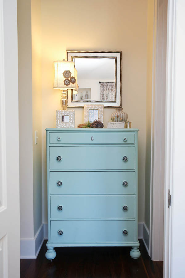
Even if you prefer to keep your walls neutral, paint can still be your key to color infusion in your space. Consider painting existing furniture (or fabulous thrift store finds) with a fresh color. Adding an emerald green or turquoise blue to an existing chest of drawers, end tables or a coffee table can make them stand out against a neutral background of softer wall and fabric colors in the room.
While paint is a wonderful and economical way to add some vibrancy to a space, soft furnishings like upholstered furniture, window treatments and rugs are another way to add interest by layering a space with color and pattern. To perk up a tired family room, bring in a new upholstered ottoman in a bright, bold print and accent with new window treatments in solid, complimenting color. To add interest to a muted bedroom, add a side chair or bench upholstered in rich, vibrant tones or bring in a fresh, bright area rug in a colorful, bold pattern to anchor the room with color and interest. Don’t be afraid to select a bold piece and decorate around it, using the colors and patterns within it as inspiration for your space.
For a More Subtle Approach
Again, start by considering your color scheme. While higher-contrast, complimentary color schemes make a bold impact, analogous color schemes use colors that are next to each other on the color wheel and can be a more subtle way to infuse color and interest into your space. Analogous color schemes are often found in nature, are harmonious, and pleasing to the eye (often a combination of warm tones – reds, oranges, pinks or all cool tones – blues, greens, violets). One key to a successful analogous color scheme is ensuring you have enough contrast (mixing rich royal blues with pale turquoise or deep emerald greens with softer, sky blues).
Even for a more subtle impact, paint is a fabulous way to add a splash of color to your space! Grab a can of vivid spray paint and liven up existing accessories or new found treasures from local thrift stores. Adding a bright blue or green to a set of photo frames, vases, candlesticks or even a lamp can give a room a new pop of color and interest. Imagine a pale blue wall covered in a photo collage of silver-leafed frames being transformed by simply spray-painting those same frames in a bold turquoise or emerald green. It instantly revitalizes the space & creates a dynamic contrast. Now, simply carry that same color scheme around the room by adding a few accent pillows or a soft throw in similar bold colors. Don’t be afraid to mix and match patterns and textures for a finished, layered effect.
For a simple spruce up for your bathroom, just grab a few bright, bold towels (I love to look for odd ones that have no mate and are often found on the clearance aisle at local home décor stores); roll them up and display them in a wooden crate to liven up the space with an effortless, casual feeling.
The kitchen may be the quickest, most cost-effective place of all to add an invigorating pop of color. Simply place a bowl of fresh fruit on the table or the countertop. The key to really making this idea pop is to use a bowl (ideally, clear glass or white ceramic for the best contrast) of the same fruits – all lemons, all limes or all granny smith apples for some fresh, vibrant punches of yellow or green tones.
Think Color! to give your home a fresh spring feeling. A color scheme of complimentary or analogous colors using paint or accessories, even with a small amount of effort, can create a large impact. You will enjoy spring indoors as well as outside!